Exposure Heatmap: The Future of Visual Options Analytics

Data is only useful if you can understand it quickly. In the fast-paced world of options trading, staring at rows of numbers can lead to "analysis paralysis." This is where the Exposure Heatmap changes the game—it turns complex multidimensional data into a clear visual story.
The Visual Edge: Real-Time Market Topography
Before diving into the numbers, let's look at the big picture. Our primary heatmap view gives you an instant snapshot of where the "institutional weight" is sitting across the entire options chain.
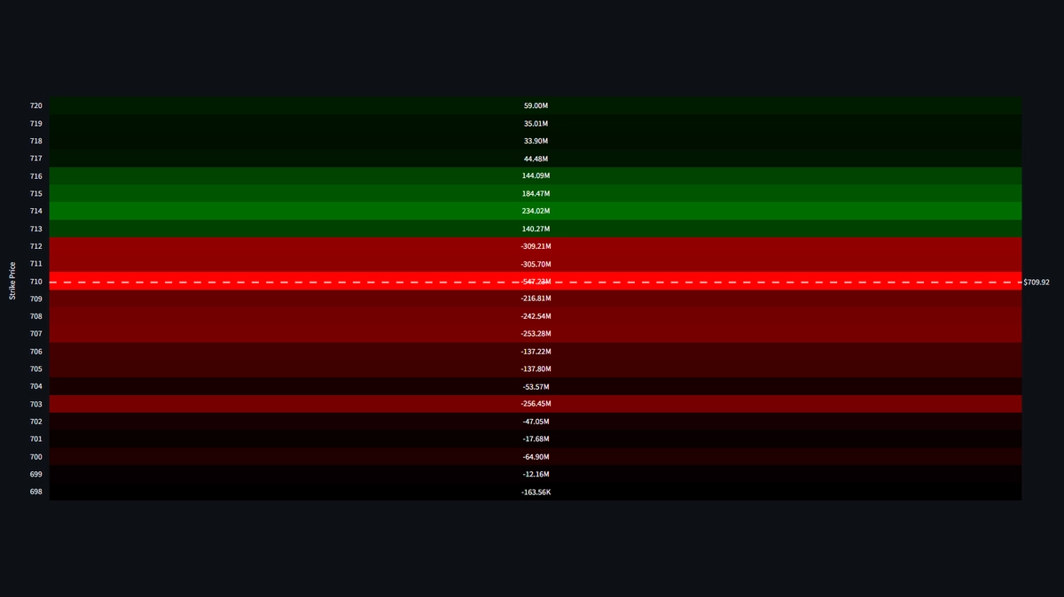
The Macro View: Identifying major liquidity zones and dealer hedging concentrations across all expirations.
Beyond the Traditional Chart
Traditional charts show you where price has been. An Exposure Heatmap shows you where the market pressure is building. By visualizing Gamma and Delta exposure across a range of strikes and expirations, you can see the literal "topography" of the market.
Bright areas represent high concentration of dealer hedging activity, while dark areas show "liquidity voids." If price is a ship, the Heatmap is the underwater map showing the reefs and deep channels.
Decoding the Visual Language
The beauty of the heatmap lies in its intuitive design. When you look at the Dashboard, you aren't just looking at colors; you're looking at institutional intent.
Deep Dive: Strike-Specific Concentration
When we zoom in, we can start to identify the exact price levels that will act as magnets or barriers. This detailed view is essential for tactical execution.
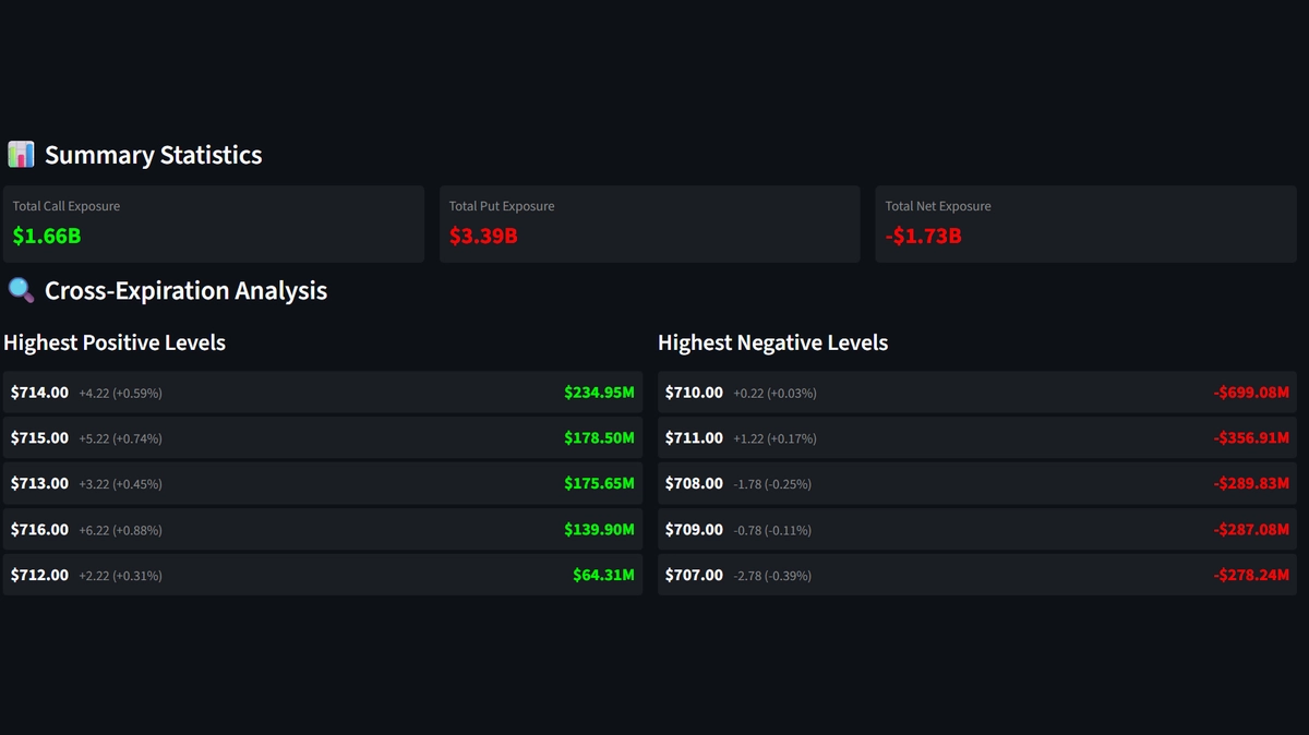
The Micro View: Analyzing specific strike clusters to predict price stalls or accelerations.
1. Gravity Wells (Concentration Zones)
High-intensity zones often act as magnets. If a massive "Call Wall" is visible as a bright stripe on your heatmap, price will often struggle to break through it, or conversely, accelerate rapidly once it does (a Gamma Squeeze).
2. The Shift of Sentiment
By watching the heatmap over multiple timeframes, you can see these zones move. Are the "walls" moving higher? That’s a bullish migration. Are they dropping? Dealers are bracing for a move lower.
Why Visual Analysis Wins
Human brains are wired to recognize patterns in images much faster than in text. By using visual analytics, you can:
- Spot Anomalies: Instantly see a strike that has an unusual amount of exposure compared to its neighbors.
- Filter Noise: Focus on the strikes that actually matter to the market structure.
- Improve Timing: Enter and exit trades based on the visual "gravity" of the market's internal levels.
The Professional Edge
"A heatmap doesn't just tell you the price; it tells you the temperature of the market. It shows you where the friction is, where the liquidity is, and where the next big move is likely to stall or accelerate."
Visual analytics isn't just a "nice to have"—it's a requirement for the modern quantitative trader. At Dashboard Options, we believe that clarity is the ultimate edge. Our heatmaps are designed to give you that clarity in a single glance.