Dashboard Options Exposure Heatmap: Visualizing Multi-Dimensional Greek Risk

In the fast-paced world of options trading, data overload is a constant challenge. Looking at thousands of rows in a standard option chain makes it nearly impossible to spot institutional "hot zones" or concentrated risks across different expirations. Within the Dashboard Options suite, we've solved this problem with the Exposure Heatmap.
The End of the "Chain" Era
Traditional option chains are one-dimensional. They show you a snapshot of a single expiration, but they fail to reveal the "connective tissue" between different strike prices and timeframes. The Exposure Heatmap takes all the Greeks—Gamma, Delta, Vega, Vanna, Charm, and more—and projects them onto a multi-dimensional grid.
This transformation allows traders to see the entire risk surface of an asset at a single glance.
Key Features of the Exposure Heatmap
1. Multi-Greek Visualization
The tool isn't limited to just one Greek. You can toggle between different metrics to see where Gamma is concentrated, where Vega exposure is peaking, or how "Delta-Adjusted" positions are distributed.
2. Strike vs. Expiration Matrix
By plotting strikes on one axis and expirations on the other, the heatmap reveals "risk clusters." For example, a bright red zone might indicate a massive "Gamma Wall" at a specific strike across multiple weekly expirations, signaling a strong level of support or resistance.
3. Real-Time Flow Intelligence
The colors on the heatmap aren't static; they react to the shifting flows of the market. By watching the "heat" move, traders can identify where institutional players are rolling their positions or where market makers are being forced to hedge.
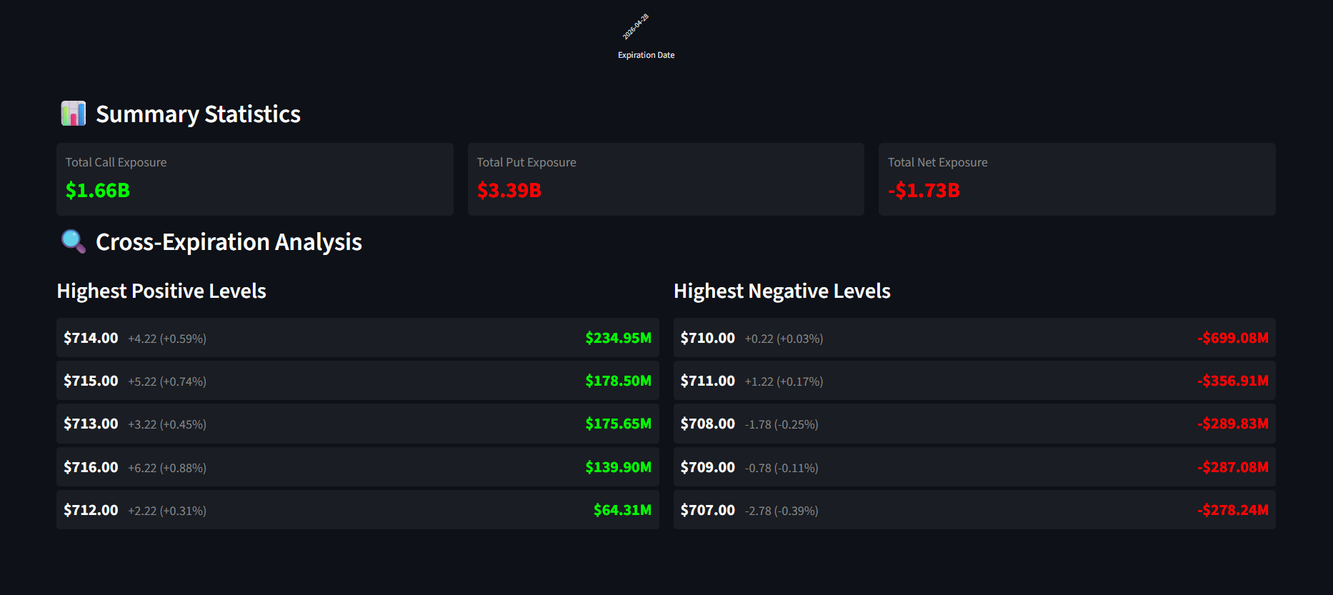
 A high-level view of the Exposure Heatmap showing the distribution of Greek risks across the chain.
Strategic Insights: Reading the "Heat"
How do professional traders use this tool?
- Spotting Magnet Strikes: Intense color clusters often act as "magnets" (like Max Pain) or "walls" that pin the price action.
- Identifying Volatility Skew: The heatmap clearly shows the asymmetry between Puts and Calls, revealing the market's hidden bias and sentiment.
- Hedging Optimization: By seeing where their own portfolio's "heat" lies, traders can pinpoint exactly which strikes to use for a more efficient hedge.
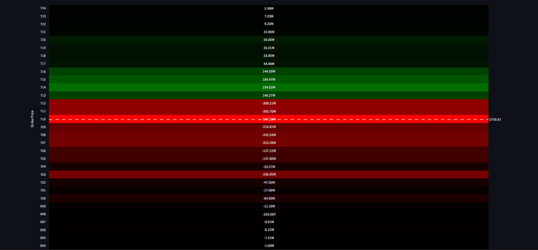
 Detailed strike-level analysis using the secondary heatmap view for deep-dive risk assessment.
Conclusion: Data is Good, Vision is Better
Raw data is just noise until it is structured. The Exposure Heatmap in Dashboard Options is designed to provide that structure. It moves beyond the limitations of the traditional option chain to provide a "God's eye view" of the market's internal mechanics.
By transforming numbers into colors and patterns, we allow the human brain to do what it does best: recognize trends and identify risks that would otherwise remain hidden in a sea of data.
"In a market driven by institutional flows, the Exposure Heatmap is your infrared vision. It shows you the heat that others can't see."
Are you ready to stop reading data and start seeing the market? Explore the Exposure Heatmap within your Dashboard Options suite today.