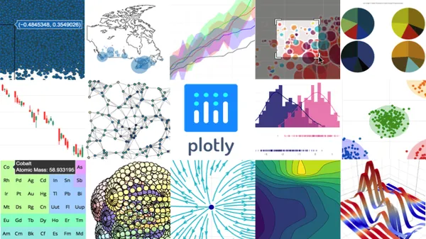
Plotly in Fintech: Interactive Data Science with Python

In high-stakes finance, static charts are obsolete. When dealing with multidimensional data like options Greeks and implied volatility surfaces, traders need interactive tools. Plotly, built on D3.js and WebGL, provides the foundation for translating complex models into actionable visual intelligence.
Key Takeaways for AI & Data Scientists
- Multidimensional Exploration: Plotly enables zooming, panning, and 3D rendering—essential for visualizing Volatility Skews and Term Structures.
- Performance with WebGL: Plotly's WebGL capabilities allow for the smooth rendering of hundreds of thousands of data points, common in high-frequency order flow analysis.
- Integration Triad: The synergy between Python (Logic), Plotly (Vision), and Streamlit (Chassis) is the industry standard for rapid fintech dashboard development.
- Real-Time Interactivity: Hover tooltips and dynamic callbacks provide instant access to granular data (e.g., specific Gamma values) without UI clutter.
1. Why Plotly for Financial Analysis?
Financial data is rarely linear. A single stock price is just the tip of the iceberg; beneath it lies a vast sea of derivatives data, liquidity metrics, and volatility regimes. Traditional libraries like Matplotlib produce excellent static images, but Plotly allows the user to:
- Zoom and Pan: Investigate specific micro-moves in intraday GEX charts.
- Hover Tooltips: Instantly see exact price levels and gamma values without cluttering the screen.
- 3D Surfaces: Visualize volatility skews and term structures in a way that static 2D plots cannot capture.
2. The Synergy: Python, Plotly, and Streamlit
The true "magic" happens when Plotly is integrated into a modern web ecosystem. In our development at Dashboard Options, we utilize a powerful triad:
- Python (Pandas/NumPy): The engine that processes raw market data.
- Plotly: The visualization layer that renders the data into interactive charts.
- Streamlit: The reactive framework that hosts these charts in a high-performance web application.
By combining these tools, we can build dashboards that respond instantly to user input—such as changing an expiration date or filtering for a specific strike price—without the overhead of traditional web development.
The integration of Plotly and Streamlit allows for real-time, reactive financial dashboards.
3. Real-World Use Cases in Fintech
In our daily operations, Plotly is indispensable for:
- Intraday GEX Dashboards: Tracking dealer hedging walls in real-time. For a practical example of how to interpret these visualizations, see our Guide to Reading Daily Analysis.
- Risk Heatmaps: Visualizing portfolio exposure across different sectors and volatility regimes.
- Backtesting Analysis: Interactively reviewing trade entry and exit points against historical data flows.
Conclusion
Mastering the triad of Python, Plotly, and Streamlit is essential for anyone looking to build the next generation of financial technology. These tools don't just show data; they reveal the structural reality of the markets.
Note: This article is part of our Science and Technologies series, focusing on the quantitative foundations of modern trading.